Case Study: Ten at Clarendon
Words: Bill Bonstra
Words: Bill Bonstra, FAIA, LEED AP
Photos: Anice Hoachlander
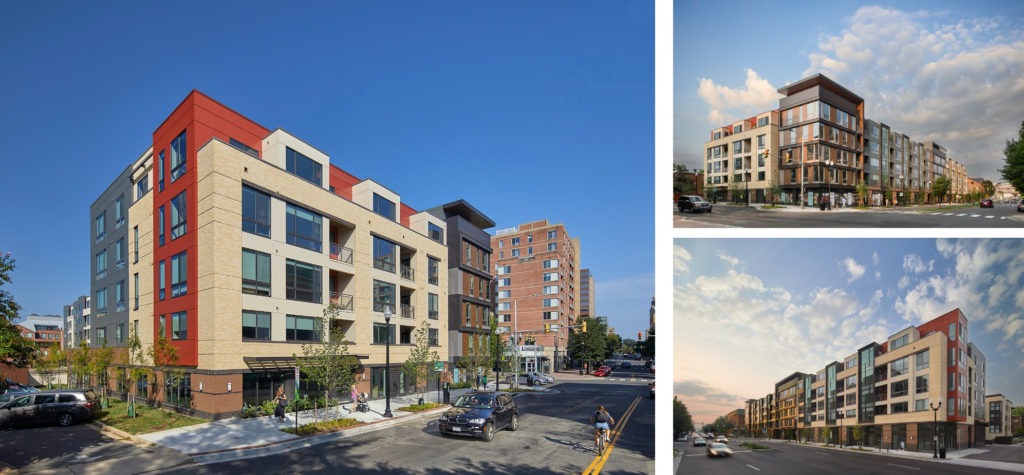
Ten at Clarendon is a LEED Platinum-certified mixed-use building - the culmination of years of planning, community collaboration, and county approvals in this urbanizing Clarendon neighborhood. Its residential entry is sited across the mid-block crosswalk that leads to METRO, while ground floor retail and offices are near the higher-density intersection. Multi-level live/work units connect to the street offering a changing storefront as the retail market strengthens.

The design accommodates many uses, unit configurations, and lifestyle concepts and amenities. Significantly improving the pedestrian realm, this is a model for new residential urban development within changing land use patterns and contexts. The rhythm and detailing of the facades make this building a fitting transition between the high-rise commercial zones and its lower-scale residential neighbors. Its lively syncopation of vertical glass bays with wood accents and balconies set against soaring masonry planes adroitly weaves itself into a varied context of older transitional buildings.

Materials
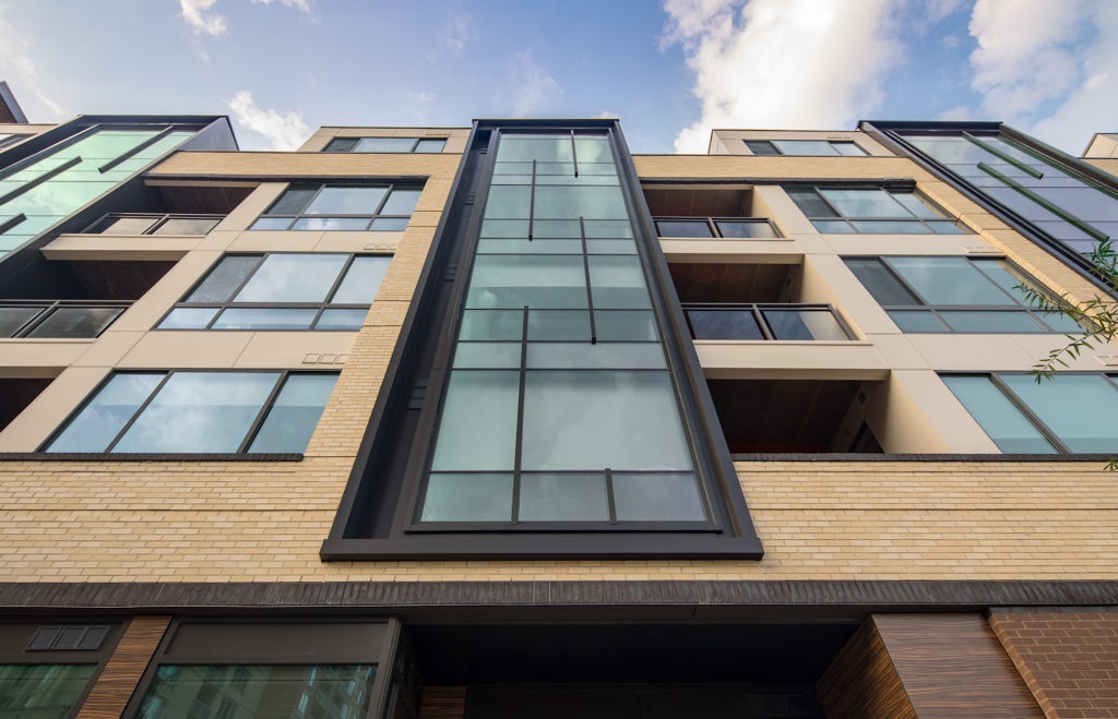
Stretching longer than a football field, the main façade of Ten at Clarendon incorporates vertical glass bays and metal fins to break down the apparent length of the overall building on this unique urbanizing site. Brick is chosen to wrap the buildings lower 2 floors and unifies a cohesive whole: a brown brick with dark iron spot stripes provide the scale and durable clay-based material as the building ‘grows from the earth’. This base wraps all exposed building facades. Four-story cream-colored brick bays “bookend” the façade composition and relates directly to the brick of the adjacent urban context.
The ability to use thin brick matching the conventional brick façades allowed the design team to create a cost-effective masonry building on a modest wood framed structure. Large openings with spans of 20 feet or longer were detailed. Modern production methods allowed designers to seamlessly switch to thin brick at the large spans – without the need for a structural steel relieving angle and support posts.

Brick is a sustainable, durable, and low-maintenance material – perfect for inclusion in this LEED for Homes Platinum rated building. By bringing the brick down to grade around the entire structure – the base condition is consistently durable: a stray snow shovel or car door won’t cause damage that might ding, dent, or destroy other less noble materials. At the lower commercial level, the brick veneer wall also allowed us to easily provide the building code mandated continuous insulation within the cavity without complicating the weather sealing of the exterior wall system.
Challenges
While wood stick framing the four floors of residential units was necessary to meet the client’s overall budget, a special design effort was made to make the building look and feel more like a high-end, concrete framed structure. A one-story concrete podium supports continuously glazed curtain wall bays – a detail rarely seen in this type of construction – and provides those units with floor to ceiling glazing. As well, deep set balconies gave a luxury level feel to an otherwise modest wood framed design. At the exterior, the façade quality was maintained in overall massing form but created with more economical cement board systems in similar colors.

Faced with long spans of brick at the upper wood framed floors proved difficult structurally. Rather than add expensive miscellaneous steel structure, we worked with the brick manufacturers to provide thin faced brick veneer in the same color and finish of the typical single wythe brick, and thus the elimination of steel framing. After many hours of hard work, Ten at Clarendon is a beautiful building enhancing the urban experience.

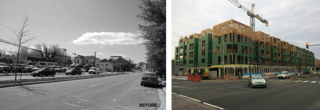
Assembly of the former used car lots and local bar and grills took years of canvassing owners and hard-fought negotiation; securing approvals for multiple schemes, getting buy-in from the neighborhood, and satisfying the lengthy list of County requirements, extended the development process beyond initial expectations. The end result, however, is a striking, modern building that accommodates a number of different uses, significantly improves the pedestrian realm, and is a model for this scale of development.