Canopy Austin Downtown Hotel Celebrates Masonry and Concrete Décor
Words: Nick Vaccaro
Words: Nick Vaccaro
Photos: Peter Molick
Like the majority of prominent cities across the United States, the city of Austin, TX harnesses its own exceptional demeanor with ties rich in culture and art. Giving way to this same theme, the architecture found throughout the city exemplifies this very school of thought. As a result, when the Canopy Austin Downtown Hotel's design was initiated, an incredibly distinctive design was manifested to produce a structure that complimented everything considered unique throughout the city.
The Canopy Austin Downtown's final construction product personifies a concept concentrated on utilizing all space available while allocating enough area for a retreat type of focus. Specific elements were considered to provide a destination location that fuels relaxation and distributes luxury throughout.

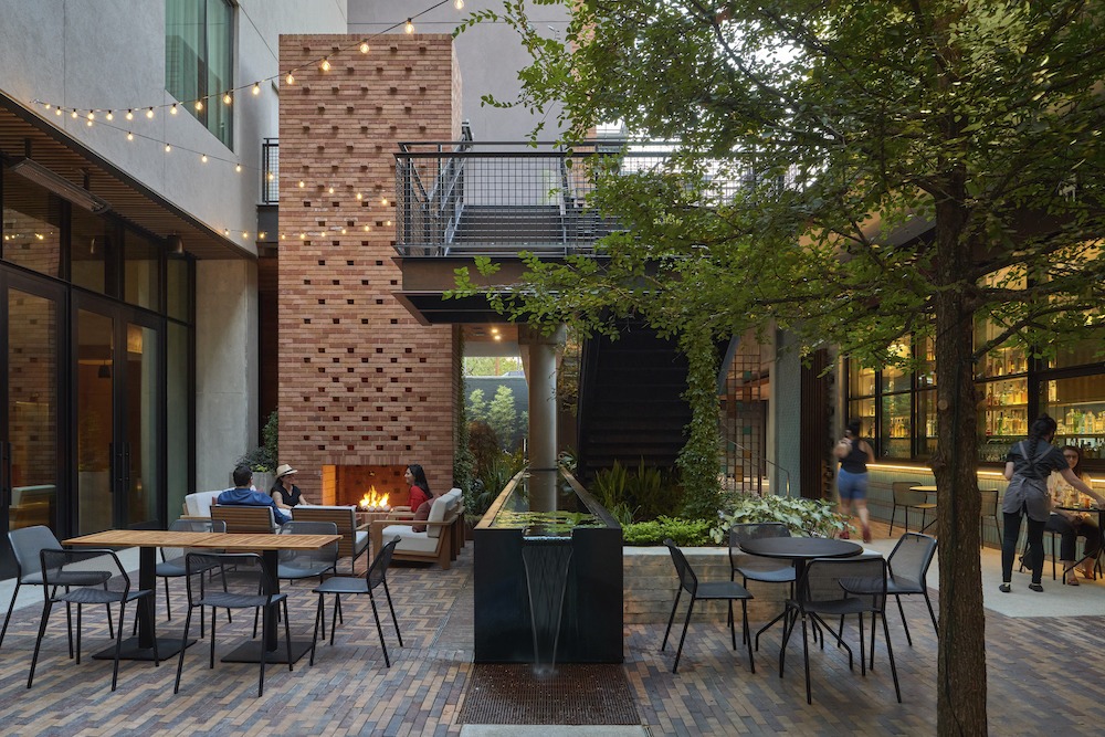
"A primary project goal was to reintroduce and restore native vegetation to the previously developed site, which had no water features. The design team increased the amount of outdoor space and integrates those spaces throughout the design, aiming to restore natural hydrological features typically associated with the local environment," said Ashley Heeren, Associate of Lake|Flato Architects, the firm responsible for the hotel's design. "A lush courtyard was designed with natural materials, greenery, and water serving as the anchor of the property."
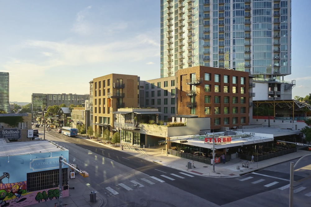
While Heeren described the property as a relaxing oasis serving as its anchor, it is surrounded by concrete and masonry structures that further energize the well-known West 6th Street corridor. Its design finds a fit of perfection, which engages Austin's art scene along with its hub of creativity.
The Design Process
Due to limited real estate for the redevelopment project, Heeren explained that the logical direction of construction was to engage in a vertical design that would take advantage of the most allowable space. The purpose found a drive-in attempting to maximize as much open space as possible.
"The design process was driven by context and climate," said Heeren. "The courtyard is designed to be self-shaded and take advantage of prevailing summer winds to maximize outdoor comfort."
Glazing minimizes increased heat gain without compromising the always appreciated natural light, encompassing an articulate plan. Windows installed deeply in the southern side to provide for a solar shading of coverage to counter the warming sun. By design, the west side windows are smaller, but those that face the north receive significant daylight due to their more extensive specifications.
Design Perspective
Heeren indicated that the project design witnessed an approximate one-year duration while the major concepts were decided upon within the first initial weeks of project work. It is conceivable to say that outdoor firms were commissioned to provide consultations that lent to the project's success.
"It takes a village to design any building," said Heeren.
Adding to the partnership's success with consulting professionals, state-of-the-art software was utilized to conceptualize the design. The team used Sketchup to study the initial design concepts and design studies throughout the project's life. Documentation received attention through Revit while some of the consulting services engaged in AutoCAD. The team additionally made use of Navisworks when managing clash detection during the construction process.

The design saw fruition through a series of processes as well as numerous mockups that continued throughout the construction process itself. This practice aided in determining the most effective palette and detail plans for the building's façade.
"We focused on the masonry more than any other material," said Heeren. "We first used digital visualizations to home in on the overall brick tones and then dry-stacked various combinations of brick blends at our office to study the stacks in shadow as well as direct sun."
After deciding on the team's preferred combinations of masonry, engaged in additional digital and physical studies to identify the optimum percentages and rules for each of the product mingles. After CW Oates, the selected masonry contractor, joined the project, the company created mockup displays for the design team.

"They created mockup panels for us confirming the brick mingles and various decorative strategies, testing various grout joint types and colors until we settled on the final direction," said Heeren. "As the brick install began, the mason taped printouts of the mockups and rules around the work areas so that these were always top of mind."
Material Specifications
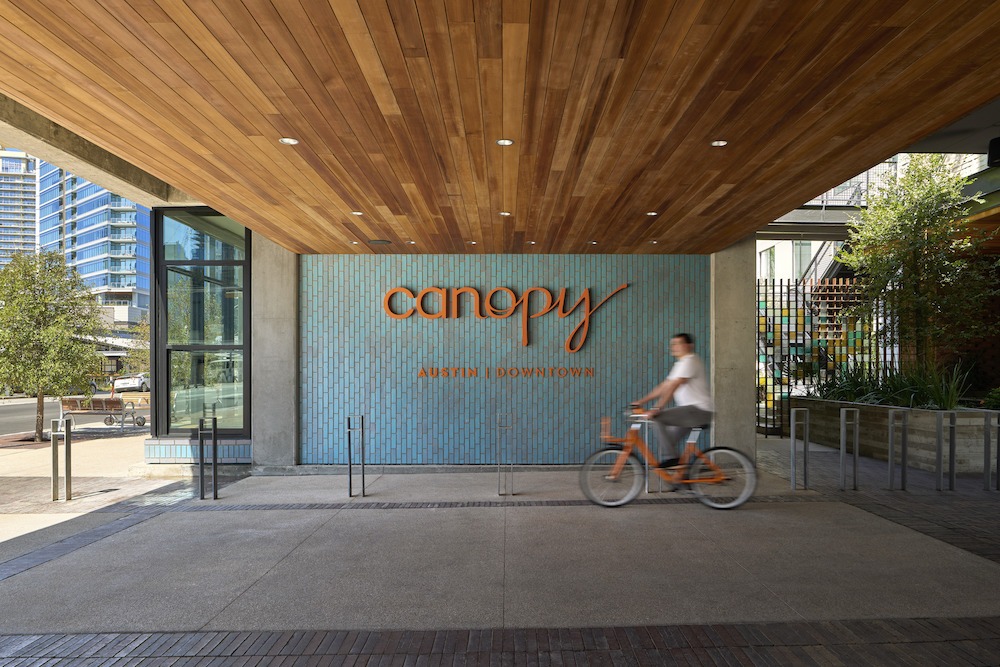
With the desire to complement the urban environment in which the Canopy Austin Downtown resides, a combination of masonry and concrete was named as the best partnership of expression for the south and eastern sides of the hotel. These two sides receive the most significant recognition from increased distances, and as Heeren described, speak with the most important distinction to the remainder of the city.
"The oldest buildings in downtown Austin, including those on East 6th, incorporate masonry and especially the traditional Austin Common brick mingle, and This material heritage inspires canopy Austin," said Heeren. "The combination of two distinct brick mingles as well as decorative brick patterns inset in the façade also work to reduce the overall scale of the site and enhance the connection to local craft at this place."
To complement the efforts exerted in masonry selection, stucco clads the north and west walls while also claiming most of the courtyard. The team carefully selected stucco colors to flatter the choice made in masonry.
"They allow the building to subtly shift in tonality depending on the viewer's perspective, further helping to break down the scale of the building and courtyard so that it feels comfortable and inviting.
Overcoming Challenges
All significant products see challenges and issues. Tenacity and a successful design rendered by seasoned professionals make the difference in responding to those challenges in reign victorious as opposed to failure and disappointment. Heeren stated that the Canopy Austin Downtown project experienced difficulties from the very beginning of conception.
The Capitol View Corridor was met with a limiting height. Shared property lines mandated required setbacks. The rear alley space provided constricted access when servicing and loading during construction. Another central area of concern was directed at noise mitigation since the project site lives in an entertaining area that embraces music and nightlife.
"During design, we were constantly tasked with solving for how to keep all elements cleanly and beautifully designed to work within these parameters," said Heeren.

Heeren credited immense coordination in overcoming these various challenges. Stellar communication exhibited by all team members enabled victorious problem-solving measures. These actions included representatives from all contractors and participants.
"When there was a bust because pipes or other elements were going to force us to lower critical ceiling heights, such as those in the café and bar that are so important to the street-courtyard connection, the full team including the contractors came together to work through rerouting options to keep the original design intact."
Considering the Canopy Austin Downtown's size and mindfulness, coupled with successful completion, it is understood that Heeren is a seasoned professional herself. That experience and knowledge are crucial in seeing a design from conception to a successful finish. It does not come with ease, and Heeren recognizes the undeniable probability that unplanned surprises will rear their ugly heads during construction but answers them with confidence.
"When the full team shares a vision for the project, it makes the problem-solving run much more smoothly."