Tepper Quad at Carnegie Mellon University
Words: Carrie Snider
Words: Carrie Snider
Photos: Albert Vecerka, Carnegie Mellon University, Ed Rombout, Esto, Jeanne Chen, Moore Ruble Yudell
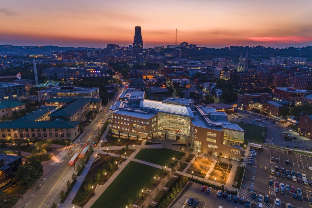
Carnegie Mellon University in Pittsburgh, PA., is known for its science and technology programs, among many others. Over the years, students have gravitated toward the school, and attendance has grown. Specifically, the Tepper School of Business had outgrown its space on the edge of campus. So the university decided to relocate it to the heart of campus.
At the same time, Carnegie Mellon also wanted to create a campus hub. Officials envisioned Tepper Quad to interconnect campus, where students of all disciples could gather to create, collaborate, and innovate. Moore Ruble Yudell worked with Renaissance 3 Architects on the project.
A Nod to Historic Masonry
The key in designing the new space was its exterior masonry work, including brickwork that harkened back to historic spaces on campus but with a twist in size and color. Franco Associates completed the masonry work on the project.
The original 1904 campus was designed by the architect Henry Hornbostel who utilized buff-colored brick manufactured by the Kittanning Brick and Fire Clay Company. For the Tepper Quad Project, completed in 2018, Moore Ruble Yudell sourced bricks from The Belden Brick Company, located just across the border in Ohio. Because of the building’s large scale, they opted for custom 21-inch bricks, much larger than normal. They were fired in rare beehive kilns.
Brick color would become one of the challenges of the project, but the Design Team knew it was important to get it just right. Pittsburgh is often overcast, so they didn’t want the bricks to disappear into the background on gloomy days. The brick and mortar colors needed to be much warmer in color.

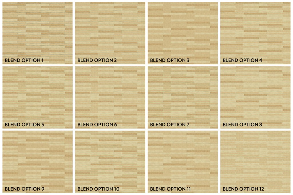
Jeanne Chen, FAIA, principal at Moore Ruble Yudell, said that they worked closely with the manufacturer, making subtle adjustments to the bricks’ shale and clay content to produce more vivid golden custom hues than the standard campus buff.
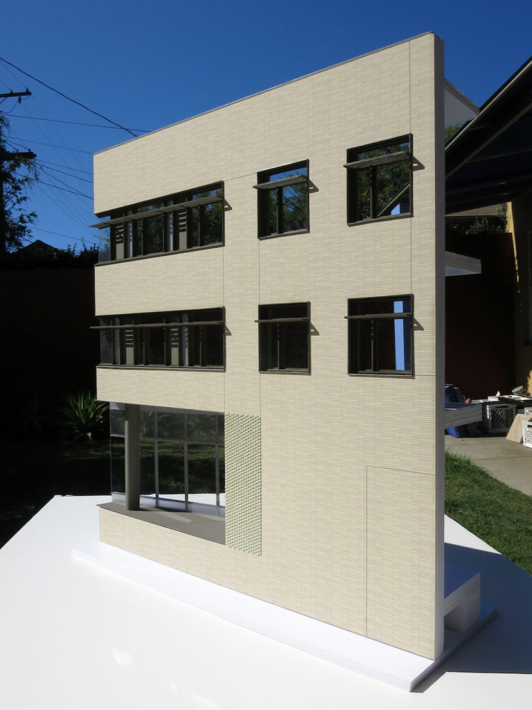
“To test blend ratios, the team utilized an exhaustive process of drawings, renderings, models, and physical mockups,” Jeanne explained. “When finally combined, the brick façade’s mixture of light, medium, and dark colors form a harmonious blend at a distance, then reveal rich complexity upon closer inspection.”
The resulting masonry work marries the historic brickwork on other buildings on campus while offering its own unique design. The varying colors of brick on the exterior of the new building are patterned and warm, making a large structure beautiful and inviting.
Interspersed with the masonry is glass, which breaks up the solid portions of brick and allows for an “outside-in” feel as well as plenty of natural light. Visual interest is achieved through the 3-D play of the brick areas and the glass areas as if bringing together the past and the future.

Unique, Enriching Features
The five-story building would, of course, house instruction rooms—24 to be exact—but organizers envisioned much more for the new central hub. A stunning atrium surrounded by wide staircases was the focal point in the center of the building—the idea being that students and faculty would feel welcome and inspired and interact in the creative space.
More open spaces on each floor were also meant to foster more interaction. Rather than closed-off corridors, the building would have large openings with curving bridges and overlooks along the atrium at each level. Students could take advantage of the seating areas for studying or gathering.
Additionally, the Tepper School of Business building would house business school instruction, but the building would welcome all through its doors, scholars and community alike. The first floor would include a welcome center, admissions office, auditorium, fitness center, technology learning center, and more.
On the upper floors would be classrooms plus staff offices, as well as commons areas including food service, conference and event space, and an executive education center. One exciting part of the new building is the Swartz Center for Entrepreneurship, which hosts startup incubators for students. These business students are not only getting first-rate education in the classroom but practical experience right next door.
Focus on Sustainable, Innovative Efficiency
Any big building like this one requires plenty of materials. However, the team wanted to focus on using less. Like the students would be focusing on inside the finished space, those constructing the building looked to innovation to make it the best it could be.
Rather than a standard flat concrete slab, recycled plastic bubbles in a honeycomb structure were incorporated. This innovative, pioneering technique helped to reduce the building’s carbon footprint while also making it stronger. The plastic balls reduced concrete by 35%, embodied energy, overall building height by 10 feet, produced floors 20% faster, and decreased construction costs by 10%.

They also cut water consumption by 50% by installing a rainwater collection system to reuse for irrigation and toilet flushing. Heating and cooling costs will be lower thanks to an underfloor air distribution system on two of the floors, as well as radiant slabs in the atrium. Finally, natural light due to extensive glazing means less electric light costs. All of this contributed to the building earning a LEED Gold designation.
Final Thoughts
When looking at the final product of Tepper Quad, it’s no surprise that it was selected as a winner of the 2019 Chicago Athenaeum American Architecture Awards. The overall design inspires any who visit the campus, either to learn as a student or to teach.
On its own, the building is a showcase of design that harkens to the past while utilizing innovations that will bring it into the future. But more than that, the attention to integrating it as a campus HUB helps to connect everyone on campus by offering areas to gather, create, collaborate, and innovate.